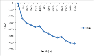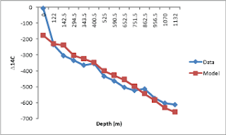
Then, I asked excel to perform a simple linear regression and spit back the resultant coefficients. Then, using the proffered slope (-0.4257) and intercept (-177.7) I modeled my data, basically by taking my X values (depth) and plugging them into a linear equation. Which, surprisingly enough, didn't give me a linear plot:

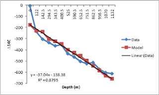
Just a tad confused, I then asked excel to do a linear regression in the plot (something I quite frequently do) and again, spit out the regression coefficients. Notice the regression coefficients here (-37.04 for the slope and -138.38 for the intercept) are rather wildly different than the original coefficients excel provided.

 Notice that although that line matches my (non-linear) model quite well, those coefficients produce wildly wrong estimates of my data when I actually crunch the numbers--not quite what I was looking for on a quiet Tuesday afternoon. I think I'll be sticking to matlab, thankyouverymuch.

Hi Kristine,
ReplyDeleteI hope you don't mind a random comment. I suspect the problem with getting a linear fit to these data in Excel is that Excel is treating the X-variable (depth) as categorical rather than continuous. That is, it's treating the depth values as equally spaced even though they're really not. Note that the differences between the first few X values are 122, 20.5, 152, and 49, but they're plotted as though equidistant along the X-axis.
I've run into this issue before and the way around I've found it to ask Excel to treat it as a scatterplot. Then it will honor the distances between X values. And you can ask for the series to be connected just like in the line plot to make it easier to look at.
I apologize for the utterly random comment. I only make it because I've read your comments a lot around the Bloggernacle and I always like what you have to say.
Ziff--thanks the explanation. Yes, that probably is what's wrong with the plot--thank you for pointing that out. I always assume plots will honor both x and y values--probably because for the most part I use matlab.
ReplyDeleteHey, an utterly random comment is perfectly appropriate on my utterly random blog :)